Images are a 2D grid of pixels and, in normal images, each pixel will have three values. We call these the RGB channels. Permutation Channel Importance (PCI) is good for obtaining one insight — which of these channels are important to a model’s predictions.
PCI does this by shuffling (or permuting) the pixels in a given channel. We do this for every image in a dataset. Then, comparing the performance of a trained model, before and after permutation, will reveal whether it uses that channel to make predictions.
This is a relatively simple XAI method. Yet, other methods like occlusion and SHAP will use permutations in a similar way. Understanding PCI will provide a good basis for understanding these more complex methods.
So in this lesson, we will:
- Explain the role of permutation in computer vision
- Give the steps of the PCI algorithm
- Explain the applications of PCI
- Apply PCI to a coastal image segmentation model
For RGB images, PCI can help explain if colour is an important aspect for prediction. However, we will see the true power of the method comes when applying it to a remote sensing problem. These typically deal with more complex inputs with many channels.
Before you get stuck into the article, here is the video version of the lesson. There is another one in the Python section.
In computer vision, permutation is when we rearrange the pixels, areas, or features of an image in a random or structured manner. For XAI, the goal is to evaluate the importance of different parts of an image for a model’s prediction. This is done by observing how the model's performance changes when those parts are permuted.
To be clear, we will always be explaining a model trained on the original data. We compare this model’s performance on the original and permuted data, and we do not train a new model on the permuted data.
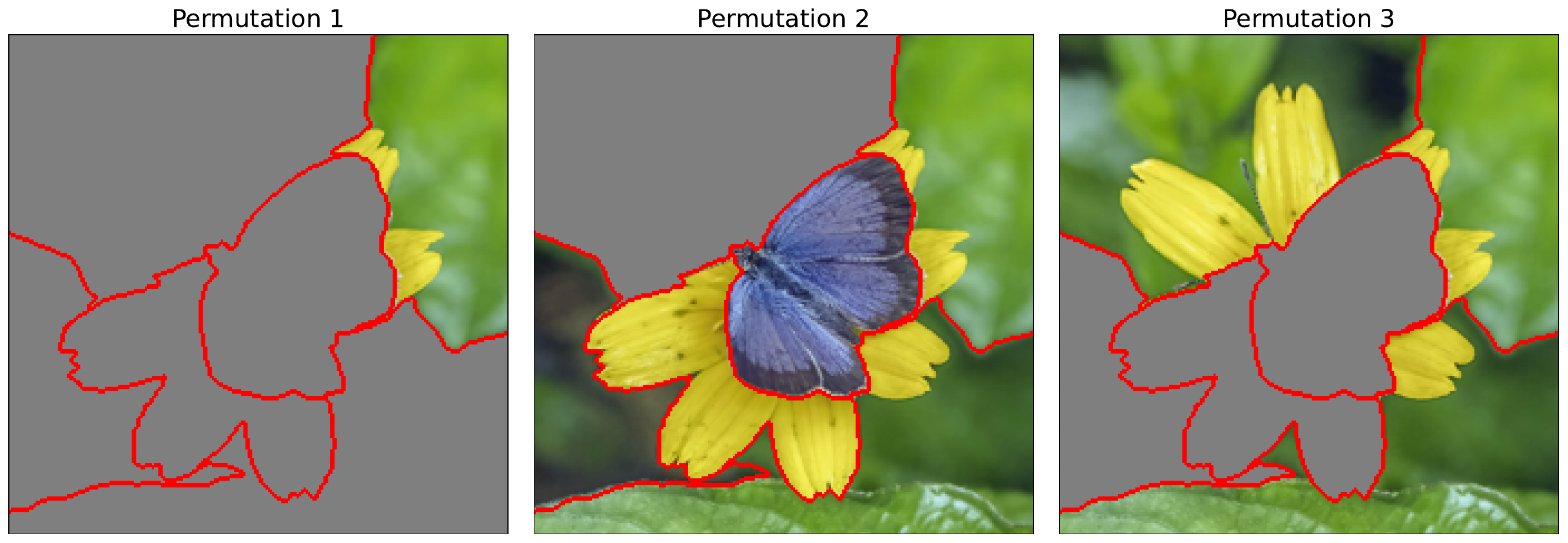
Many XAI methods rely on permutations in some form. Occlusion maps are created by systematically masking squares of pixels. In comparison, as seen in Figure 1, SHAP and LIME permute different combinations of sets of pixels. These can be individual pixels or groups called superpixels. This is to estimate their marginal contributions (i.e. Shapley values) to the model’s prediction. In comparison, PCI uses a more rudimentary permutation process.
Permuting a Channel
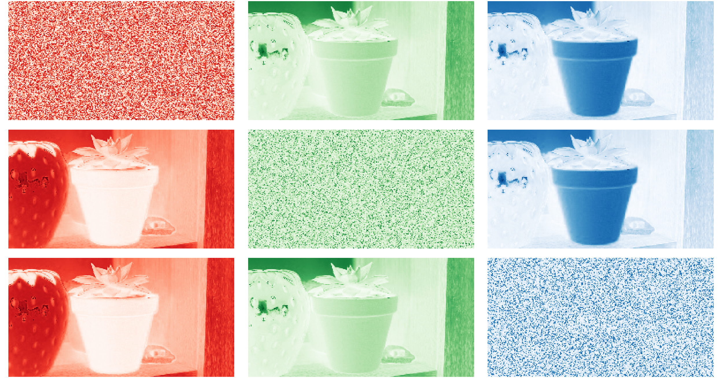
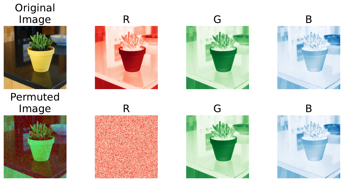
For PCI, we shuffle every pixel in a channel. You can see this in Figure 2 where the red channel has been shuffled. Using the Original Image, we can predict what type of plant this is. If the predicted probabilities using the Permuted Image change significantly, then the red channel is being used by the model to make the prediction for this instance. Repeating this process for all channels and images in a dataset will tell us which channels are important in general.
So, unlike occlusion or SHAP, which can tell us which region of an image is important for an individual instance, PCI will tell us if an entire channel is important across all instances. This is a similar insight to Permutation Feature Importance (PFI) for tabular data. Both methods provide global interpretations.
In a later section, we discuss the insights into our model PCI can bring. In particular, we will see how it is more important for applications that use multispectral imagery. Before that, it is worth defining the PCI algorithm more formally.
The PCI algorithm
To calculate PCI scores, we start with some initial values/choices:
- \(c\) is the number of channels.
- \(n\) is the number of images.
- \(k\) is the number of random permutations per image to average over.
- \(f(x)\) is a trained model
- \(p\) is our performance metric
For RGB images, \(c\) will be 3. We will see that for other areas like remote sensing, \(c\) can be larger. \(n\) is usually the size of the validation or training dataset. Lastly, we need \(k\) as the permutation process is random. Repeating it will give us a more stable estimate of the PCI scores.
To calculate PCI, we start by getting a baseline performance value. To do this, we use the \(n\) images before they are permuted as input into \(f(x)\). Using the model’s predictions, we can then calculate the value for \(p\). This is our baseline.
Then, for a given channel \(i\), we calculate the PCI score by:
- Permutation: For all \(n\) images, we randomly shuffle the pixels within an image of that channel.
- Prediction: We use the permuted images as input to the trained model to generate predictions.
- Performance: We calculate \(p_i\) across the \(n\) images using the model’s predictions with the permuted channel.
- Importance: We compare the permuted performance, \(p_i\), to the baseline, \(p\). This is typically done by subtracting the values to find the decrease in performance, \(p- p_i\).
- Repeat: We repeat the steps \(k\) times and take the average decrease in performance, \(p - \frac{1}{k}\sum_k p_i\).
In the end, the average decrease in performance is our PCI score. The precise interpretation will depend on our choice of p. For classification, we can use metrics like accuracy or AUC. For regression, we can use MSE or R-squared. When we apply PCI, we will be dealing with an image segmentation model. In this case, we use average accuracy as our performance metric.
Applications of PCI
As mentioned, PCI can tell us one thing—which channel is most important. The usefulness of this will depend on your problem. For RGB images, we can tell if colour is important or if images could be converted to greyscale. However, we will see that it becomes more useful when dealing with multispectral images. These include additional channels above the three visible light bands.
RGB images
To understand the insights for RGB images, let’s consider the Pot Plant dataset (CC BY 4.0). This is an image classification problem where we aim to predict which pot plant is in the image. You can see an example from the four classes in Figure 3.

When we apply PCI to a model trained on this dataset, we get similar scores for each channel. Specifically, the accuracy on the validation set decreased by 0.35, 0.39 and 0.35 percentage points for the Red, Green and Blue channels respectively. This tells us that all channels are being used to make predictions.
However, when we look at scores for each class separately, we can gain more insight. This is done by dividing the validation set into 4 groups based on the class label. Looking at Figure 4, we can see that a channel’s importance varies. For example, the green channel is most important when making predictions for Rudo, but the least important for Greg.
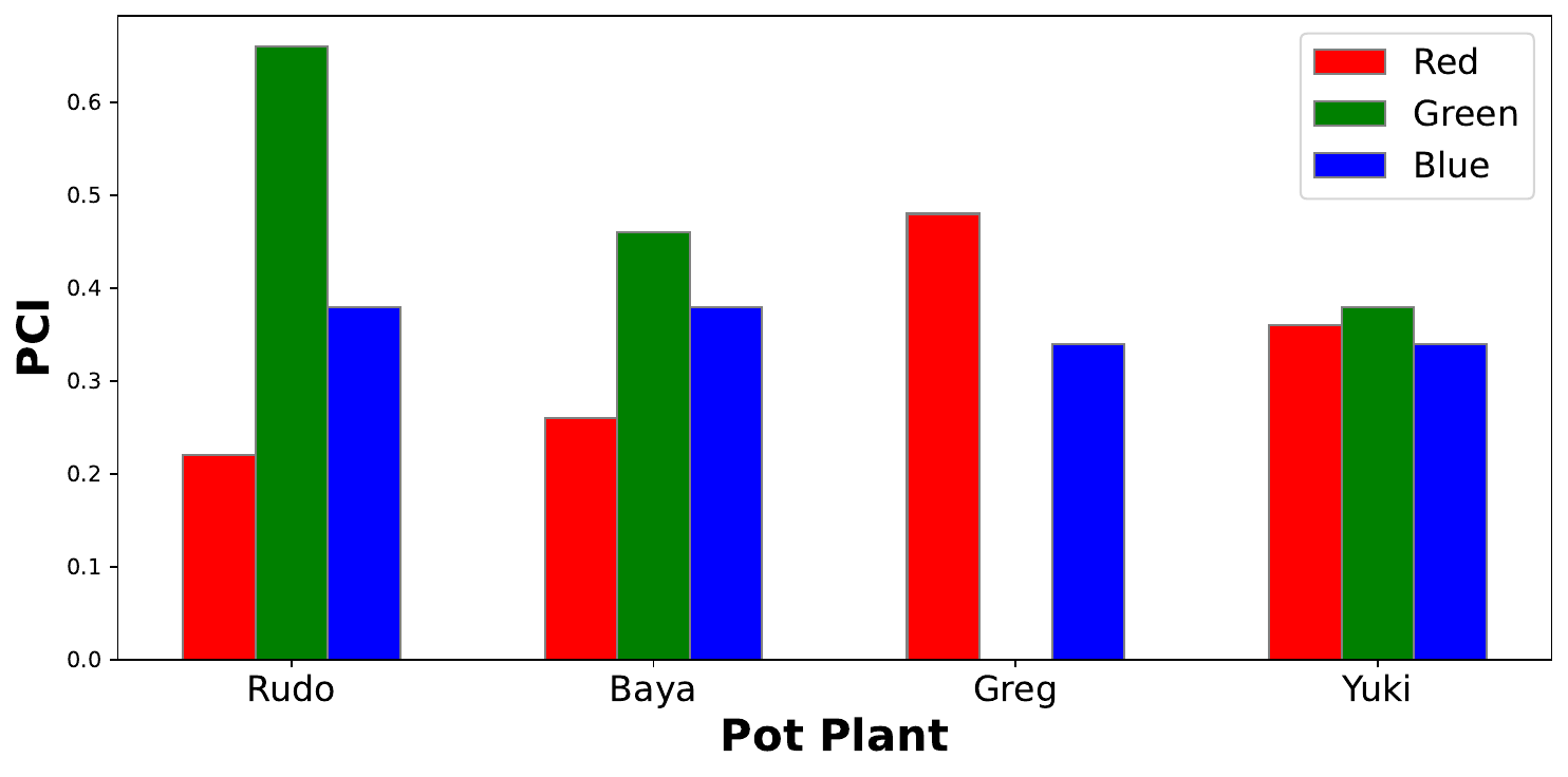
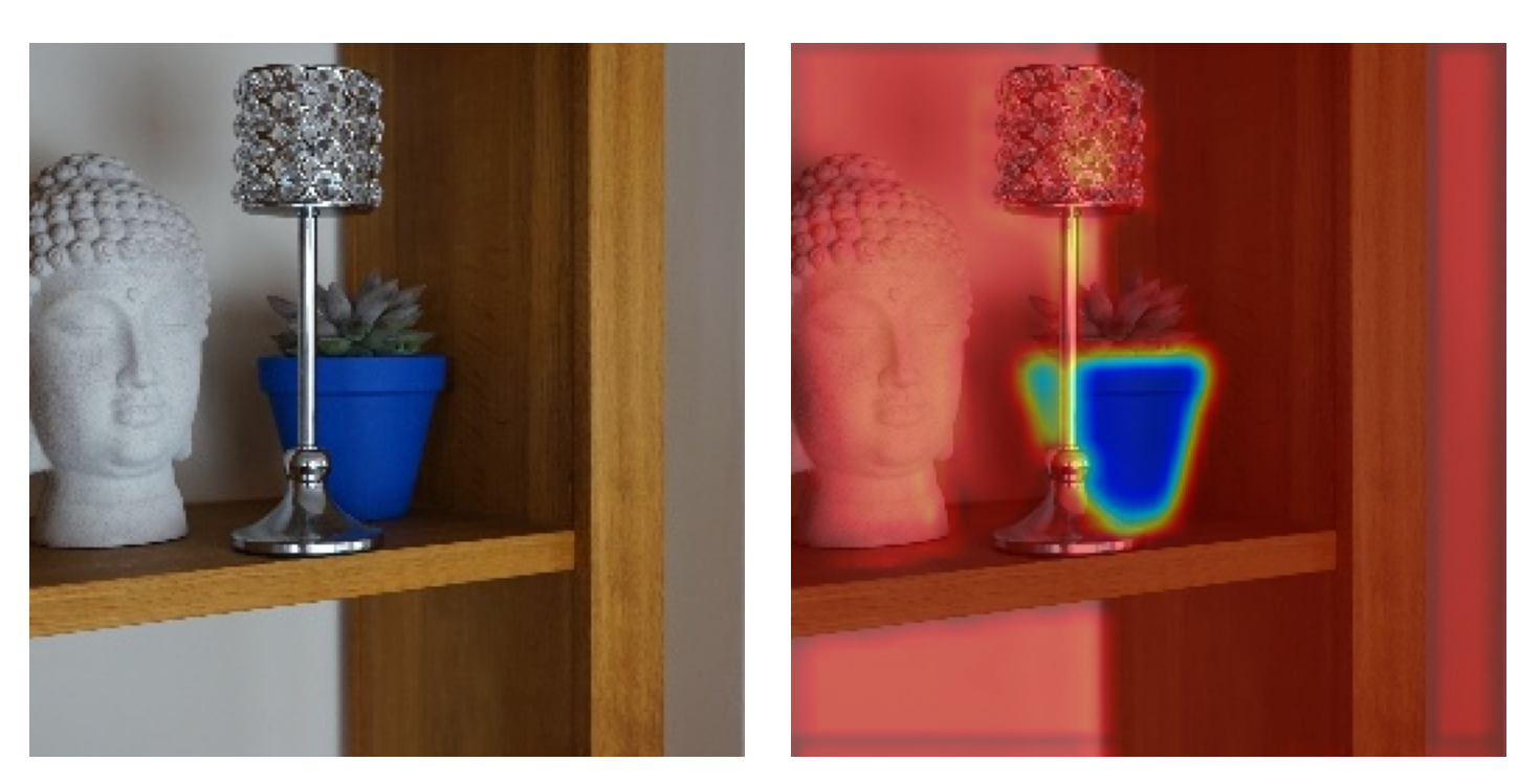
We see this result because the brightly coloured pots have introduced bias into our dataset. In a later lesson, we will use saliency maps to show that the model is using the pixels from the pots and not the plants to make predictions. The results in Figure 4 provide additional evidence that it is the colour of the pots that is causing errors.
In general, we can use PCI to understand if colour is important to the prediction. If only one channel is used by the model, then we can simplify the model input by greyscaling or only selecting the channels that are important. This can be useful, but these insights become far more valuable when dealing with more complex data sources.
Multi-spectral imagery
The RGB colour we see is reflected radiation or light waves of different wavelengths. In remote sensing, we deal with “images” taken with advanced sensors on satellites or other aircraft. Multispectral images include wavelengths that are not visible to the human eye, like the near-infrared (NIR) band. We can also deal with microwaves from synthetic aperture radar (SAR) or data quality channels that segment objects like clouds.
These new channels have the same structure as RGB channels — a grid of pixel values. Looking at Figure 5, this means we can use the same deep learning architectures. In this case, it is only the first convolutional layer that needs to be adjusted so that it accepts the correct number of input channels.
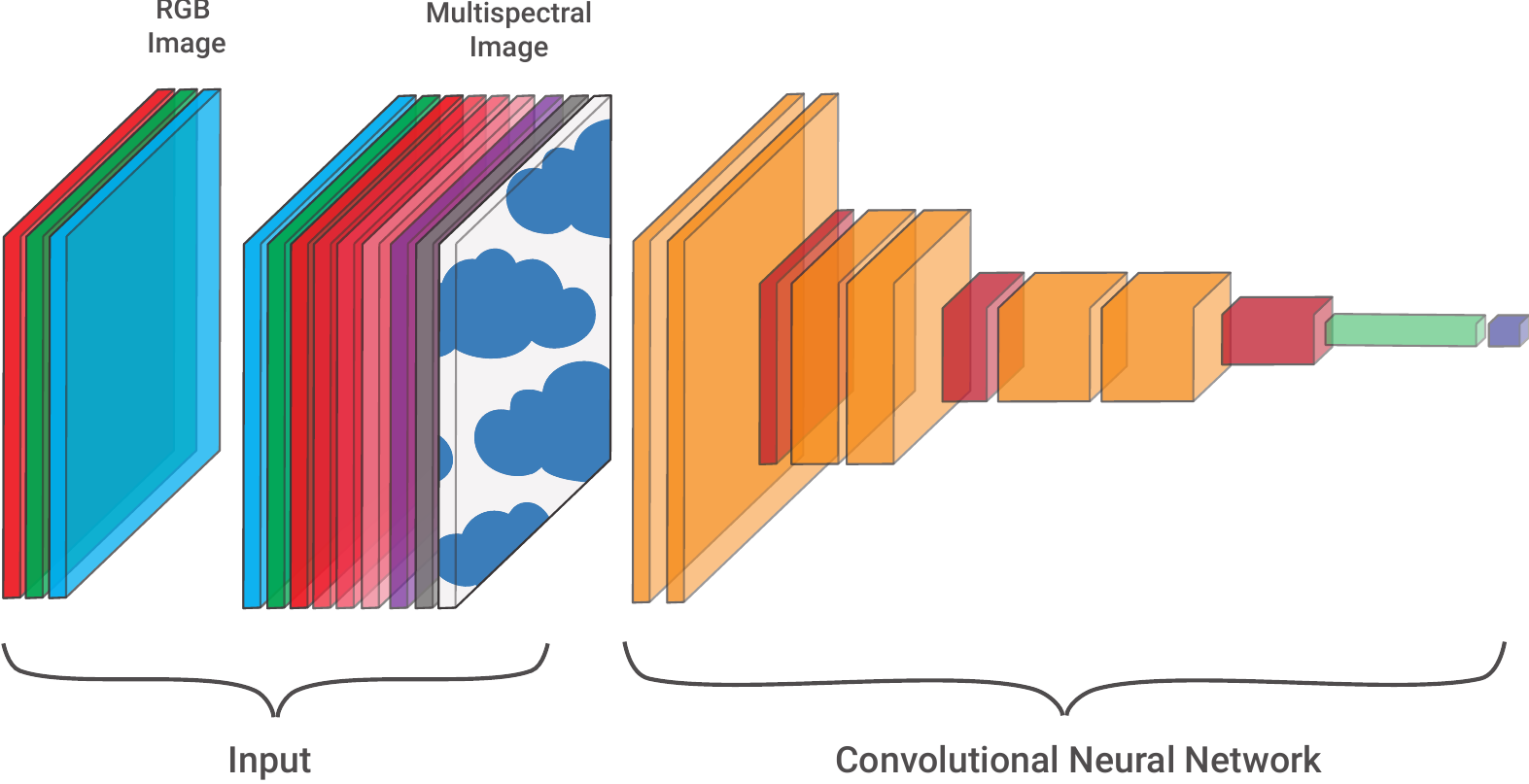
The increased complexity of the input data is why PCI is generally more useful for remote sensing problems. We will see this when we apply the method to a coastal image segmentation model. It allows us to compare the inner workings of the model to more traditional research in this area.
Applying PCI with Python
To apply PCI, we will use the Landsat Irish Coastal Segmentation (LICS) Dataset (CC BY 4.0). It was developed to aid the development of deep learning methods for coastal water body segmentation [1]. Specifically, we will use the LICS test set. This contains 100 multispectral images. As seen in Figure 6, each image has a binary segmentation mask (target). This classifies every pixel as either land (0) or ocean (1). We also have 7 spectral bands available as input.
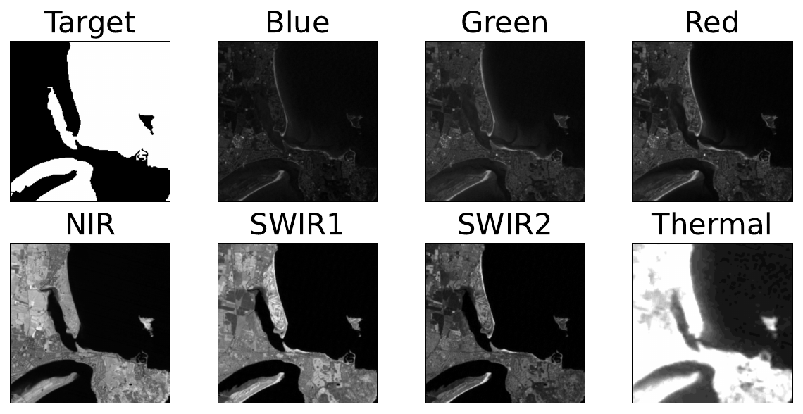
Models that have already been trained on LICS are available on Hugging Face. We will be using the model with the highest accuracy on the LICS test set. It was trained using a two-step transfer learning approach. Let’s load the model and data to better understand how we can work with them.
Load data and model
We start with our imports. In the src directory, there is a folder called utils. We load the SegmentationDataset class from datasets.py in this folder (line 18). This is the same class used to train the model.
# Imports
import numpy as np
import matplotlib.pyplot as plt

import random
import glob
from tqdm import tqdm

import torch
from torch.utils.data import DataLoader

from huggingface_hub import hf_hub_download

# Load python files
import sys
sys.path.append('../')

from utils.datasets import ImageDataset, SegmentationDataset
We load the paths for the 100 images in the LICS test set (line 2). We then pass these paths into the SegmentationDataset class to make a dataset object (line 5). This allows us to load the data in the correct format for input into the model.
# Load paths
paths = glob.glob('../../data/LICS/test/*')

# Create dataset object
lics_dataset = SegmentationDataset(paths)
We load our model from the Hugging Face repo (lines 2-3). We then move this model to a GPU (lines 5-8) and set it to evaluation mode (line 9). Now, let’s see how we can use this model to make predictions.
# Load simpleCNN model trained on SIVE dataset
model = torch.hub.load("conorosully/coastal-segmentation-models",
                                    "finetuned_lics",force_reload=True)
# Set the model to evaluation mode
device = torch.device('mps' if torch.backends.mps.is_built()
                      else 'cuda' if torch.cuda.is_available()
                      else 'cpu')
model.to(device)
model.eval()
We load an instance of our dataset (line 2). This will include the 7 spectral bands and the target. We move the bands to the GPU (line 5), add a dimension for batch size (line 6) and get a prediction from our model (line 7).
# Load first instance
bands, target = lics_dataset.__getitem__(3)

# Make a prediction
input = bands.to(device)
input = input.unsqueeze(0)
output = model(input)
Before visualising, we must consider the shape of the target is (2, 256, 256). This is because we have two classes — land and water. Similarly, the shape of the output is (1, 2, 256, 256). In this case, we have 2D arrays of scores for each of the two classes with the additional dimension for batch size.
print(target.shape) #(2, 256, 256)
print(output.shape) #(1, 2, 256, 256)
We format the target and output using the argmax function. For both, this gives us an array of pixels with dimensions (256, 256). Each pixel will have a value of either 0 or 1. For example, when applied to the output (lines 5-6) a pixel will have a value of 0 if the land score was higher and 1 otherwise.
# Get the water mask
target_water = np.argmax(target, axis=0)

# Get the predicted water mask
output = output.cpu().detach().numpy().squeeze()
output = np.argmax(output, axis=0)
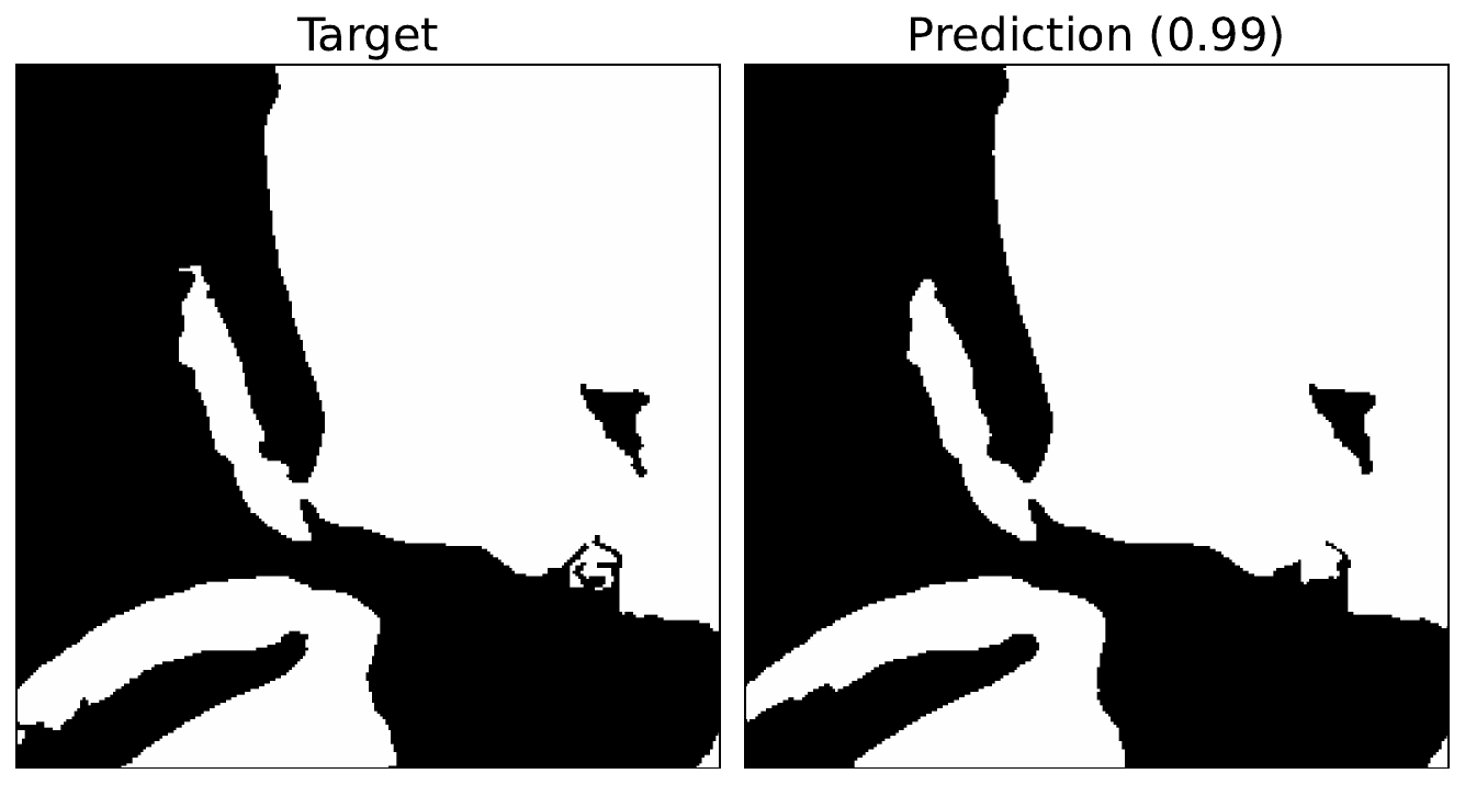
Figure 7 shows the formatted target and output. We can see the model gives a good approximation of the coastline but lacks some granular details. The number in brackets gives the accuracy of the prediction. This tells us that 99% of the pixels have been correctly classified. Now, let’s try to understand how this model is making this prediction.
# Plot the prediction
fig, axs = plt.subplots(1, 2, figsize=(9, 5))
axs[0].imshow(target_water, cmap='gray')
axs[0].set_title('Target', fontsize=16)

axs[1].imshow(output, cmap='gray')

accuracy = np.mean(np.array(target_water == output))
accuracy = round(accuracy, 3)
axs[1].set_title(f'Prediction ({accuracy})', fontsize=16)

for ax in axs:
    ax.set_xticks([])
    ax.set_yticks([])
Functions for PCI
We have a few functions to help us do this. The first will calculate the various performance metrics. The PCI method can be applied to any problem. This is why we have included the accuracy calculation for classification problems. This function can be adapted to include any relevant metric.
For segmentation, we also calculate accuracy. Keep in mind that each test instance will have its own accuracy value. This is why we take the average accuracy across all the instances (lines 8-14).
def performance_metric(targets, predictions, type='segmentation'):
    """Calculate the performance metric for the model"""

    targets = np.array(targets)
    predictions = np.array(predictions)

    if type == 'segmentation':
        # Calculate average accuracy
        accuracy_list = []
        for t,p in zip(targets, predictions):
            accuracy = np.mean(t == p)
            accuracy_list.append(accuracy)

        metric = np.mean(accuracy_list)
    if type == 'classification':
        # Calculate accuracy
        metric = np.mean(targets == predictions)

    return metric
The next function will permute a given channel in an image. To do this, we get the channel (line 12) and flatten it (line 13). We then shuffle the array (line 16), resize it to the original dimensions (line 17) and replace the original channel (line 18). We want to use this image as input into the model so the last step is to format it as a tensor (line 21).
def shuffle_channel(img, channel):
        """Shuffle a given channel of an image
            img: tensor, image to shuffle with shape (batch, channels, height, width)
            channel: int, channel to shuffle"""

        # Get size of the image
        size_x = img.shape[2]
        size_y = img.shape[3]

        # Flatten the channel
        perm_img = img.to('cpu').detach().numpy()
        perm_channel = perm_img[0][channel]
        perm_channel = perm_channel.ravel()

        # Shuffle the channel
        random.shuffle(perm_channel)
        perm_channel.resize(size_x,size_y)
        perm_img[0][channel] = perm_channel

        #Convert to tensor
        perm_img = torch.tensor(perm_img)

        return perm_img
The last function will calculate the performance metric for the entire dataset after a given channel has been permuted. You can see we format the data and get predictions in a similar way as before. Except now we are looping over the entire dataset using a PyTorch DataLoader (line 4). Now let’s see how we can use these functions to plot PCI values.
def get_permuted_performance(model, dataset, channel=-1, type='segmentation'):
    """Calculate the performance metric for the model with permuted data"""

    data_loader = DataLoader(dataset, batch_size=1, shuffle=False)
    model.eval()

    targets = []
    outputs = []

    for image, target in iter(data_loader):

        # Format target
        target = target.numpy().squeeze()
        target = np.argmax(target, axis=0)

        # Permuted image
        if channel != -1:
            image = shuffle_channel(image, channel)

        # Get prediction
        image = image.to(device)
        output = model(image)

        output = output.cpu().detach().numpy().squeeze()
        output = np.argmax(output, axis=0)

        # Append to list
        targets.append(target)
        outputs.append(output)

    metric = performance_metric(targets, outputs, type=type)

    return metric
Calculating PCI
You may have noticed that, in the above function, we have the option to calculate the performance on data that is not permuted. That is, by setting channel = -1. We use this to calculate a baseline performance score (line 2). This gives us an average accuracy of 98.5% over the 100 images in the LICS test set.
# Get baseline performance
baseline = get_permuted_performance(model, lics_dataset, channel=-1, type='segmentation')
print(f'Baseline accuracy: {np.round(baseline,3)}')
Now, let’s use the function to calculate PCI when we permute a channel. In this case, we select channel 3 which is the NIR band (line 2). Now, we get an average accuracy of 60.5%. Subtracting this from our baseline gives a PCI score of 38 percentage points. If you run this code, you may get a slightly different value. This is due to the random nature of the permutation.
# Get nir performance
nir = get_permuted_performance(model, lics_dataset, channel=3, type='segmentation')
print(f'NIR accuracy: {np.round(nir,3)}')
print(f'PCI: {np.round(baseline - nir,3)}')
Next, we repeat this process for all channels (line 4). We also make sure to repeat the calculation 3 times for each channel (line 7) and then take the average of those values (line 12).
pci_scores = []

# Repeat for all channels
for channel in tqdm([0,1,2,3,4,5,6]):
    # Repeate the calculation 3 times
    metrics = []
    for r in range(3):
        metric = get_permuted_performance(model, lics_dataset, channel=channel, type='segmentation')
        metrics.append(metric)

    # Calculate PCI
    pci = baseline - np.mean(metrics)
    pci_scores.append(pci)
Finally, we can plot our PCI scores. You can see the output in Figure 8. This suggests that NIR is the most important spectral band for this model. This is followed by SWIR 2 and SWIR 1.
band_names = {0: 'Blue', 1: 'Green', 2: 'Red', 3: 'NIR', 4: 'SWIR1', 5: 'SWIR2', 6: 'Thermal'}

# Plot the PCI scores
fig, ax = plt.subplots(1, 1, figsize=(8, 4))
ax.bar(band_names.values(), pci_scores)

ax.set_ylabel('PCI', fontsize=16, fontweight='bold')
ax.set_xlabel('Spectral Band', fontsize=16, fontweight='bold')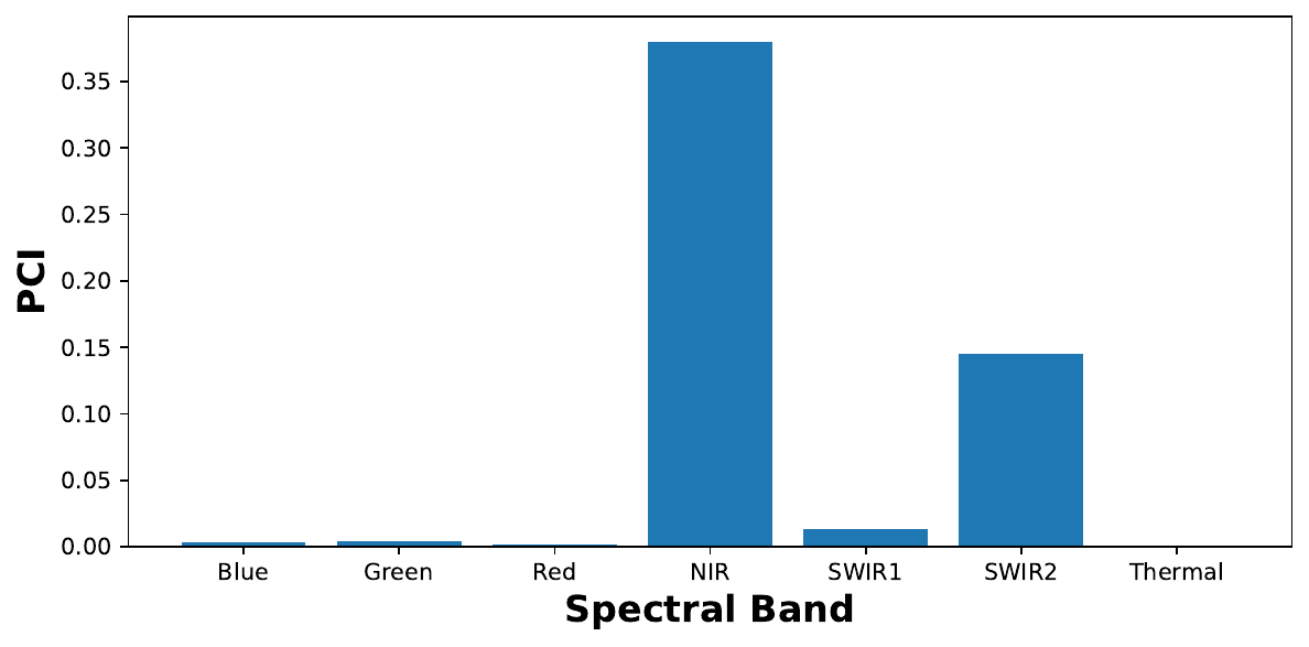
This is an interesting result. These are all infrared bands and they are commonly used in traditional, deterministic approaches for water body segmentation [2]. In fact, the NIR band is particularly important for this task [3]. In other words, the model uses spectral bands that are consistent with previous research.
This is one of the benefits of this type of research. Through explaining the model, industry professionals are more likely to trust it. This is especially true if the way it works is consistent with their domain knowledge. From a machine learning perspective, these results are also useful. Based on them, we may be able to reduce the number of channels used to train future models.
Challenge
Due to the non-linear nature of neural networks, channels can be used in combination. Adjust the functions above to permute combinations of bands. Are certain groups more important than any individual band?
I hope you enjoyed this article! See the course page for more XAI courses. You can also find me on Bluesky | YouTube | Medium
Additional Resources
- YouTube Video: Permutation Feature Importance from Scratch
- Research paper: Interpreting a Semantic Segmentation Model for Coastline Detection
- YouTube Playlist: SHAP with Python
Datasets
Conor O’Sullivan, & Soumyabrata Dev. (2024). The Landsat Irish Coastal Segmentation (LICS) Dataset. (CC BY 4.0) https://doi.org/10.5281/zenodo.13742222
Conor O’Sullivan (2024). Pot Plant Dataset. (CC BY 4.0) https://www.kaggle.com/datasets/conorsully1/pot-plants
Conor O'Sullivan (2024). Road Following Car. (CC BY 4.0). https://www.kaggle.com/datasets/conorsully1/road-following-car
References
- O'Sullivan, Conor, Xavier, Dev, Soumyabrata. The Landsat Irish Coastal Segmentation (LICS) Dataset.
- C. O'Sullivan, S. Coveney, X. Monteys, et al. (2023). Interpreting a Semantic Segmentation Model for Coastline Detection. Proc. Photonics \& Electromagnetics Research Symposium (PIERS).
- Mondejar, Jeremy P, Tongco, Alejandro F (2019). Near infrared band of Landsat 8 as water index: a case study around Cordova and Lapu-Lapu City, Cebu, Philippines. Sustainable Environment Research, 29, 1--15.
Get the paid version of the course. This will give you access to the course eBook, certificate and all the videos ad free.
