Much of Explainable AI (XAI) research revolves around developing new methods to explain model predictions. What is equally important is answering the question, “Are these explanations any good?”
At first, this may seem like an easy problem. We could simply look at saliency maps to understand if they identify important features. The problem is that, by doing this, we may be selecting methods that are visually pleasing or that confirm our preexisting biases. We need more objective ways of understanding if a method truly explains a model’s inner workings.
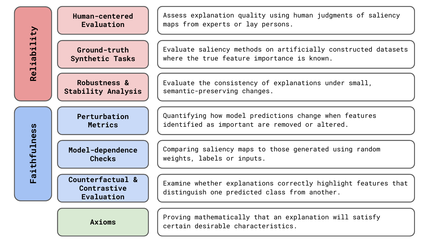
This is why various evaluation approaches have been proposed. We’re going to be discussing the 7 general areas seen in Figure 1. As we will see, they all have their own limitations. This makes it difficult to draw conclusions about the reliability and faithfulness of saliency maps.
Before you get stuck into the article, here is the video version of the lesson.
Reliability and faithfulness of XAI methods
As we can see in Figure 1, different evaluation approaches will focus on different empirical characteristics of explanations. To define these:
- Reliability: A saliency method is reliable if it produces stable, consistent explanations under similar conditions and behaves predictably across different inputs.
- Faithfulness: A saliency method is faithful if its explanations accurately reflect the true computational process of the model.
Reliability is about producing explanations that are stable and useful in practice. If you run a saliency map multiple times on similar input, you should get similar explanations. The results should also be presented in a way that makes sense for your application. On the other hand, faithfulness is about accurately representing what the model is actually using to make its decision. The saliency maps should show features that truly drive the model's prediction, not just features that happen to correlate or seem plausible.
When developing XAI methods, you can be presented with a trade-off between these characteristics. You could consider any explanation a summary of the internal workings of a model. To be reliable, you may need to sacrifice some accuracy in reflecting these. Otherwise, you will have a saliency map that is too noisy or does not reveal important features in a way that a human can comprehend.
The characteristics are similar in that they both face the same issue—it is difficult to quantify them. In evaluating XAI methods, we are presented with a dreaded unknown uncertainty. That is, we do not know if an explanation is incorrect or how likely it is to be incorrect. This is due to a lack of ground truth.
The problem of ground truth
When you want to evaluate a new architecture, cost function, or any other hyperparameter, the process is largely the same. You train a model on benchmark dataset(s) and evaluate it on an independent test set(s). If performance increases, you can claim your method is better than others. The key to this is test sets with accurate ground truth labels, which we can compare to model output.
Ground truth is the "correct answers" or the best possible answers produced using the same input as the model or any other additional information. Some examples include the output of a legal case or a medical diagnosis. For image data, it is an animal label given by a biologist or, as seen in Figure 2, a segmentation mask drawn by a geologist. The problem is that for model explanations, we no longer have this ground truth.

With saliency maps, we are trying to understand what information in the input the model used to produce the output. This process is not based on something we know or understand, like a legal system, animal taxonomies or physical properties of the earth's surface. It is inherent to the internal workings of the model. This is what we are trying to discover in the first place.
This problem is why many methods for evaluating XAI methods have developed. They all tackle the lack of ground truth in a different way. That is from relying on human judgment and synthetic ground truth to falsification through model randomisation. However, as we will see, no approach can completely eliminate the uncertainty associated with explanations.
Six empirical approaches to evaluating XAI methods
Human-centered evaluation (user studies)
Often with explanations, the goal is to explain model output to a human or to support human decision-making. A natural approach then is to assess whether a human finds that a saliency map provides a reasonable explanation. Formally, this is done using user studies. These are experiment setups that assess explanation quality based on judgments made by human users, typically domain experts or lay participants. We compare approaches by asking multiple people which explanation is best and aggregating their answers.
For example, when comparing SHAP to LIME and DeepLIFT, [1] constructed two simple models that could be understood by lay persons. The first produced a sickness score based on the presence of three symptoms. The second produced a profit amount based on three features. These were designed so that the relationship between the input and output could be easily understood. The researchers then compare the explanations for different methods to those given by a human for the same input.
Shifting to expert judgement, another example comes from medical imaging [2]. Looking at Figure 3, radiologists were asked to segment X-rays for the areas they believe contribute to a given diagnosis. The researcher then produced saliency maps that show the areas in the X-ray used by the model to produce a given diagnosis. The quality of saliency maps was assessed using the overlap between the expert and model segmentations.
![Saliency maps obtained from explanations vs segmentations drawn by expert radiologists. A large overlap suggests an explanation method provides useful information for understanding a diagnosis (source: [2]).](https://adataodyssey.com/wp-content/uploads/2026/03/evaluation_xray_user_study_wp.png)
Although practically useful, we must be aware of what sort of conclusions can be drawn from these approaches. For the X-ray example, by comparing saliency maps to expert segmentations, we are not assessing how well a method explains a model diagnosis. We are assessing how useful the explanations are in revealing all infected areas. The saliency maps depend as much on the model as they do on the XAI method, and to make accurate predictions, a model may not need to use all infected areas. This means we cannot say an explanation is unfaithful to the model, only that the combination of model and XAI method is unreliable for this specific application.
There is also the problem of human bias— we may prefer methods that confirm or bias or those that produce simplified explanations that focus on only a few features. This may happen when using the approach taken when evaluating SHAP. In their case, it was not a problem. The models were so simple that a human could produce faithful explanations of their inner workings. However, for more complex models, we have no way of understanding if this bias is present due to the lack of ground truth.
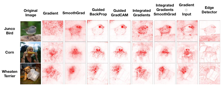
For image data, this means we may be biased towards saliency maps that look reasonable. This problem is illustrated by [3] in Figure 4. The output for the edge detector is obtained using a deterministic algorithm that is not dependent on the model's parameters. The problem is that it is similar to the saliency map produced by the various XAI methods. If asked in a blind study, you may be inclined to agree that this provides a reasonable explanation for the model prediction. In general, this means user studies can be used to make conclusions about reliability but not faithfulness.
Ground-truth synthetic tasks (toy tests)
With user studies, we mitigate the lack of ground truth with human judgment. We do this by designing specific tasks where answers from both humans and models can be compared. Ground-truth synthetic tasks, or toy tests, are similar. Except we now construct datasets or tasks for which the true explanatory factors are known by design. That is, we know the ground truth to which we will compare the model's answers.
You can see some examples in Figure 5 and Figure 6. The first dataset varies the colour of different parts of the same image of a flower. The different combinations correspond to different classes [4]. The second randomly generates different cell types and backgrounds [5]. In each case, we can compare the saliency map to a segmentation mask that gives the location of the features that can discriminate classes.
![examples of synthetic ground truth masks from the an8Flower dataset. Different coloured parts correspond to different classes. The mask gives the part that can be used to discriminate a given class (source [4]).](https://adataodyssey.com/wp-content/uploads/2026/03/evaluation_synthetic_flowers_wp.png)
![examples of synthetic ground truth masks for a cell classification problem. Each cell type has a distinct shape and is generated on top of a random background (source [5]).](https://adataodyssey.com/wp-content/uploads/2026/03/evaluation_synthetic_cells_wp.png)
The problem with this approach is that the artificially constructed task may not be realistic. We can add variation through various random augmentations. However, these datasets will likely never contain as much variation as real ones. Clearly, for the flower example, classification of flower types is more complicated than using colour alone. These simplifications may lead to differences in the internal workings of a model, and our conclusions may not extrapolate to classification tasks in general.
Robustness and stability analysis
These previous two methods focus on reliability as they help us understand if an explanation is practical. Another aspect of reliability is consistency. This is where stability tests come in. Typically, they make small changes to images and compare the resulting saliency maps using similarity metrics like correlation or SSIM. The changes include small amounts of Gaussian noise or minor image transformations (e.g. slight rotations or brightness changes) and are done so that the output of the model does not change significantly. If an XAI method is stable, then we should not have large variations in saliency maps due to these changes.
Stability is a problem observed in many XAI methods and it has resulted in the SmoothGrad approach. Essentially, we can make saliency maps more robust by taking an average over multiple images. Where each image has been altered by adding some random Gaussian noise. This improves reliability as we can be more certain that the saliency maps highlight important pixels and not just those resulting from random quirks in the network.
Robustness analysis is also where XAI meets the field of adversarial machine learning. A field that is primarily concerned with developing methods that are robust to adversarial attacks. When it comes to explanations, as seen in Figure 7, non-noticeable noise can be added to images in a way that significantly changes the saliency map. That is without changing the prediction class. This could stop us from understanding how a prediction was made or lead us to conclude that the wrong features in an image have led to the given outcome.
![adversarial perturbations resulting in misleading explanations. The original map gives the saliency map for the original image of the dog. The manipulated map gives the saliency map for the same method and model using the perturbed image of the dog. Although the perturbed image is visually similar and the predicted class is the same, the manipulated map now resembles those for the target image of a cat (source [6]).](https://adataodyssey.com/wp-content/uploads/2026/03/evaluation_adverserial_wp.png)
Perturbation-based metrics
The previous three methods are focused on reliability. They help us understand if a method will give us useful explanations. Now we move on to assessing faithfulness. Perturbation-based methods do this by ranking pixels according to their importance, obtained from a saliency map. We then permute the pixels and measure changes in the model output. If a saliency map provides a faithful ranking of importance, then we should see significant changes in the output.
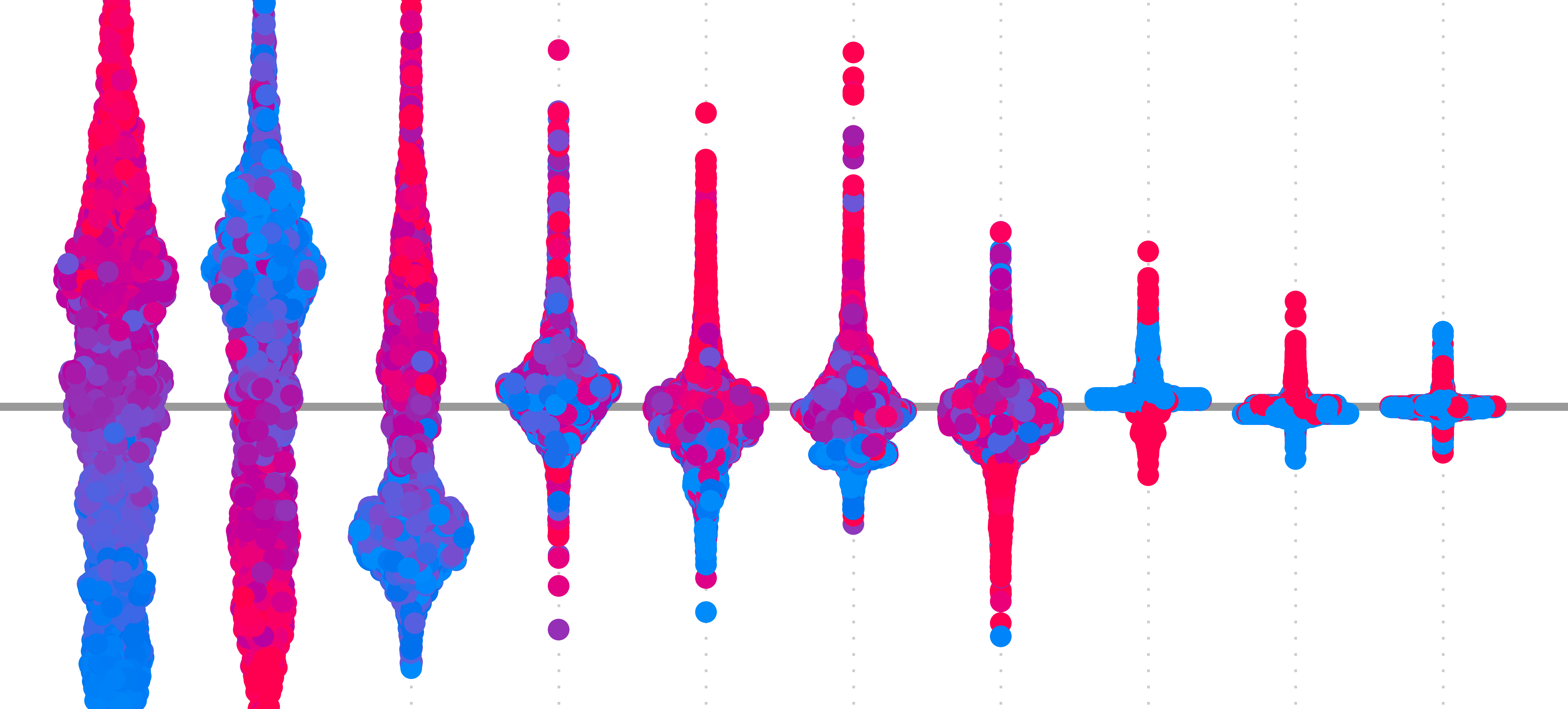
A popular approach is the deletion-insertion metric [7]. This works by progressively removing pixels by masking them (deletion) or first blurring an image and then progressively unblurring pixels (insertion). Both operations are done in order of the pixels' importance and, as we progress, we plot the model's output vs the number of permuted pixels. You can see some example curves for the deletion process in Figure 8. When a curve drops off faster, like for the RISE method, it means the predicted score for the target class has decreased more rapidly. We measure this by calculating the area under the curve (AUC). A lower AUC suggests the pixel ranking better reflects what the model used to make a prediction.
![deletion curves for goldfish classification. The pixels are ranked using the saliency maps in the first rows. The curves on the second row show the predicted probabilities for the goldfish class as we delete each pixel (source [7]).](https://adataodyssey.com/wp-content/uploads/2026/03/evaluation_deletion_insertion_wp.png)
A key issue with this approach is that it assumes features act independently. We are changing one pixel at a time. However, the features captured by neural networks are typically nonlinear and interact in complex ways. We must also consider that the masked and blurred images are unlike normal images. This means the model was not exposed to similar images during training, and any changes in its output may be confounded with this distribution shift.
Model-dependence checks (randomisation)
The next approach provides a falsification test for a minimal requirement of faithfulness. It ensures that saliency maps are different from those obtained from a randomised model. Where we are randomising either the parameters of the network or the classes of the data before training the model. Comparison to the original model will show whether the saliency method is sensitive to the learned parameters rather than reflecting the generic input structure. This is also referred to as a sanity check for saliency maps [3].
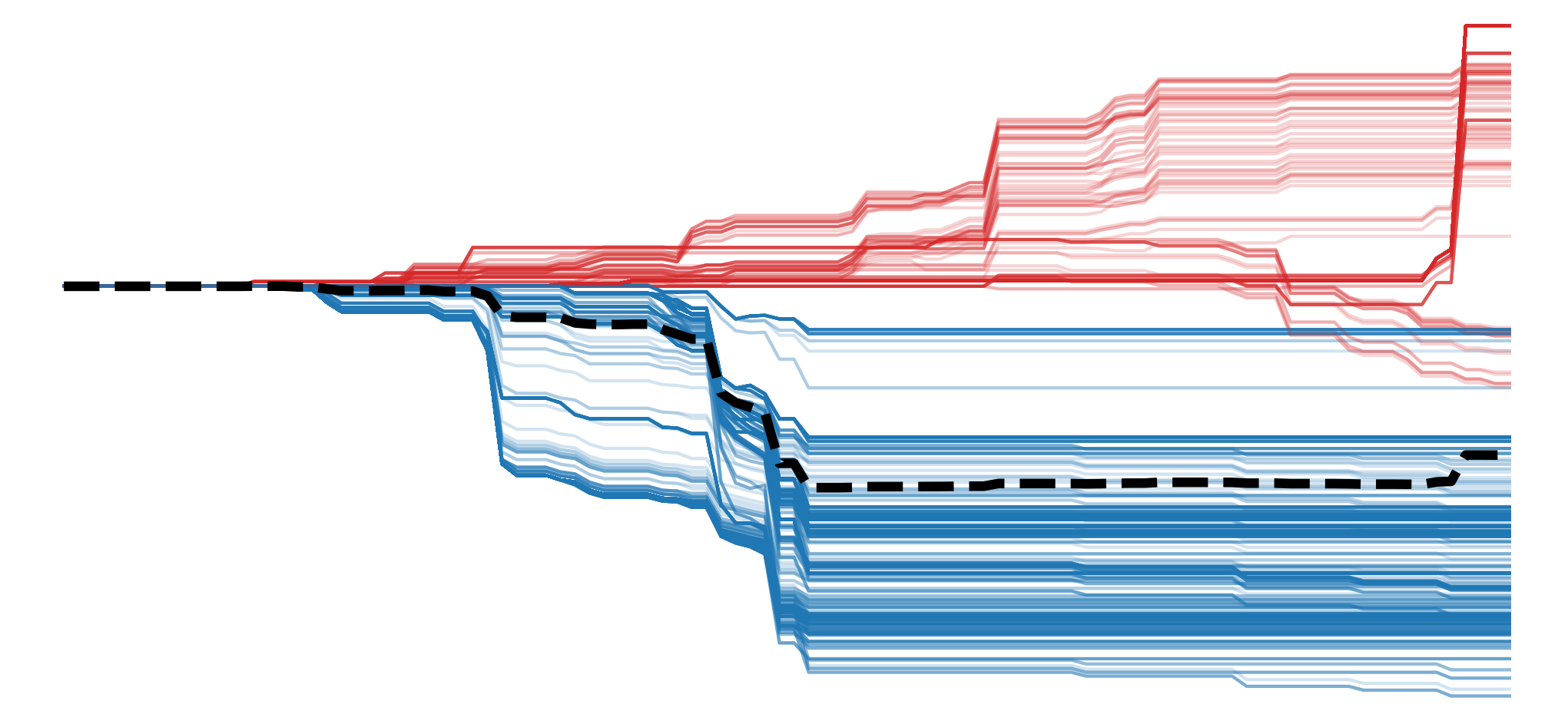
You can see an example of such a test in Figure 9. The researchers took a model trained on ImageNet and progressively randomised parameters from the earlier layers to the deeper layers of the network. For each iteration, they display saliency maps for various methods. You can see that for most methods, the maps change significantly as more of the network is randomised. However, the ones for Guided Backpropagation (GBP) stay the same, suggesting this method only depends on the model's structure and not on its learned parameters.
![sanity check for saliency maps. The first column gives the saliency maps for the pretrained ImageNet model. The layers of the network are given in the first row. We randomise the network starting from the deepest layer (logits), progressing to the earlier layer (conv2d_1a_3x3) and display the saliency maps for each step. By the end, the entire network is randomised (source: [3]).](https://adataodyssey.com/wp-content/uploads/2026/03/evaluation_sanity_check_wp.png)
Based on this, you may be tempted to skip the lesson on GBP entirely. However, further experiments have shown that the above results are due to the nature of the task and the ImageNet dataset [8]. As we can see with the example in Figure 9, ImageNet was curated so that many of the images have a single object centred in the middle of the image. This means there are more edges, textures or patterns in this area, and even randomised network will tend to highlight it.
As seen in Figure 10, when we move to an alternative task, GBP no longer fails the test for faithfulness. This uses a model that was fine-tuned to classify pairs of images. These pairs are constructed so that only one image is related to the target class, and the other image is randomly selected. Now you can see that, although the randomised and pretrained ImageNet models produce similar explanations, the saliency maps from the model trained for this task only highlight the relevant image.
![GBP saliency maps using an alternative classification task (source [8]).](https://adataodyssey.com/wp-content/uploads/2026/03/evaluation_sanity_revisit_wp.png)
The results from this additional experimentation do not mean that the falsification tests are useless. They can still provide valuable information about faithfulness. We must just be more aware of how the task and dataset can confound the results. Like all hypothesis tests, we should also keep in mind that we can only falsify the null hypothesis. They do not tell us how accurate an explanation is to the model's internal workings and if we do not fail these tests, we cannot claim that the saliency map is faithful.
Counterfactual and contrastive evaluation
A counterfactual is a minimally modified version of an input that produces a different model prediction. For tabular data, we can use these two answer questions, like "How much should the patient's blood pressure decrease to predict low cardiovascular risk instead of high risk?" or "How much should a person's income increase to receive a loan?" Figure 11 shows some examples of counterfactuals for image classification [9]. Here, they are used to find the smallest areas in query and distractor images that should be swapped so that classification changes from one to the other. This reveals the features that are most important when comparing the two classes.
![a counterfactual visual explanation. The minimal area in each image is found so that the classification changes from the bird in the query image to the one in the distractor image (source [9]).](https://adataodyssey.com/wp-content/uploads/2026/03/evaluation_counter_factual_wp.png)
With contrastive evaluation, we use counterfactual reasoning to test if saliency maps are faithful. That is, by understanding if explanations meaningfully capture the differences between classes or if modifying the important features changes the prediction as expected. An example comes from the DeepLIFT paper in Figure 12. Using a model trained on the MNIST dataset, they identified pixels that could be deleted to change the class from one number to another. For example, subtracting the saliency map for class 3 from class 8 (\(S_8 - S_3\)), should show the pixels important for class 8 and not important for class 3. After deleting the most important pixels, a significant change in scores suggests that the explanation successfully revealed the features used to distinguish between the classes.
![contrastive evaluation using the MNIST dataset. The saliency maps for both classes 8 and 3 are shown. These are used to identify the pixels important for distinguishing between the two classes. The mask image shows the result of deleting the most important pixels. Visually, we can see that DeepLIFT has identified pixels that can change the image to a 3 (source [10]).](https://adataodyssey.com/wp-content/uploads/2026/03/evaluation_deeplift_example_wp.png)
The visualisation in Figure 13 provides a more general method [11]. This is called a test of discriminativity, and it can be used when two or more classes are in the image. Here we calculate two saliency maps — one for the dog class (\(S_d\)) and one for the cat class(\(S_c\)). Both are scaled between 0 and 1. We then subtract the latter map from the former (\(S_d - S_c\)). A diverging colour map is used so that all negative values are more blue and positive values are more red. The idea is that we should have clearer visualisations for methods that can identify features used to distinguish the two classes.
![test of discriminativity. Red pixels are important for the dog class, and blue pixels are important for the cat class. A clearer visualisation suggests the method was better at identifying discriminative features (source [11]).](https://adataodyssey.com/wp-content/uploads/2026/03/evaluation_discriminativity_test_wp.png)
This type of analysis is limited in that we will always need to compare two classes. For the MNIST dataset, it is easy to delete pixels to change an 8 to a 3 or a 4 to a 1. For more complex comparisons, this is harder. For example, trying to change a car into a dog. We also run into the same problem that saliency maps for individual classes have. That is, we cannot be sure if we are selecting methods that are visually appealing or confirm our biases about what is important for distinguishing between two classes.
Axioms
With all these limitations of empirical methods, we may be tempted to rely on hard mathematical proofs. By that, we mean evaluating methods based on their axioms or mathematical properties. We discuss these in depth in the next lesson. For now, just know that the idea is that certain mathematical properties will lead an explanation that is more reliable. For example, by ensuring that a method explains an entire prediction (i.e. completeness) or that a feature importance won't change under certain transformations (i.e. affine scale invariance). To a lesser extent, they can also help ensure faithfulness. For example, by ensuring that features that do not contribute to a prediction get 0 importance (i.e dummy).
A key issue is that there is no XAI method that can satisfy all the desirable axioms. Additionally, even if a method does satisfy many axioms, this does not necessarily mean it will be appropriate. Axioms should be treated more as initial evidence that a method may provide a good explanation. In practice, however, additional empirical evaluation is needed to ensure a method is reliable and faithful enough for a given application. Yet, as we have seen, each of these approaches has inherent limitations.
User studies can bias us toward visually pleasing explanations. Toy test may not reflect the complexity of real-world data. Stability analysis reveals consistency issues, but cannot tell us anything about practicality or faithfulness. Perturbation-based metrics assume feature independence and introduce distribution shifts. Model-dependence checks only provide a minimal test of faithfulness, and contrastive evaluation results in the same issues as evaluating saliency masks for individual classes.
This presents a fundamental challenge for assessing both the reliability and faithfulness of XAI methods. Due to a lack of ground truth, we cannot know if an explanation is incorrect or how likely it is to be incorrect. This is an uncertainty that can never be fully eliminated. The best we can do is use multiple evaluation methods to reduce it. Ultimately, when applying XAI, it is important to acknowledge this limitation, along with the others we will explore in a future lesson.
Challenge
Choose one of the saliency methods from the course and apply the deletion-insertion metric from scratch.
I hope you enjoyed this article! See the course page for more XAI courses. You can also find me on Bluesky | YouTube | Medium
Additional Resources
- YouTube Playlist: XAI for Tabular Data
- YouTube Playlist: SHAP with Python
Datasets
Conor O’Sullivan, & Soumyabrata Dev. (2024). The Landsat Irish Coastal Segmentation (LICS) Dataset. (CC BY 4.0) https://doi.org/10.5281/zenodo.13742222
Conor O’Sullivan (2024). Pot Plant Dataset. (CC BY 4.0) https://www.kaggle.com/datasets/conorsully1/pot-plants
Conor O'Sullivan (2024). Road Following Car. (CC BY 4.0). https://www.kaggle.com/datasets/conorsully1/road-following-car
References
- Lundberg, Scott M, Lee, Su-In (2017). A unified approach to interpreting model predictions. Advances in neural information processing systems, 30.
- Saporta, Adriel, Gui, Xiaotong, Agrawal, Ashwin, et al. (2022). Benchmarking saliency methods for chest X-ray interpretation. Nature Machine Intelligence, 4(10), 867--878.
- Adebayo, Julius, Gilmer, Justin, Muelly, Michael, et al. (2018). Sanity checks for saliency maps. Advances in neural information processing systems, 31.
- Oramas, Jose, Wang, Kaili, Tuytelaars, Tinne (2017). Visual explanation by interpretation: Improving visual feedback capabilities of deep neural networks. arXiv preprint arXiv:1712.06302.
- Tjoa, Erico, Guan, Cuntai (2022). Quantifying explainability of saliency methods in deep neural networks with a synthetic dataset. IEEE Transactions on artificial Intelligence, 4(4), 858--870.
- Dombrowski, Ann-Kathrin, Alber, Maximillian, Anders, Christopher, et al. (2019). Explanations can be manipulated and geometry is to blame. Advances in neural information processing systems, 32.
- Petsiuk, Vitali, Das, Abir, Saenko, Kate (2018). Rise: Randomized input sampling for explanation of black-box models. arXiv preprint arXiv:1806.07421.
- Yona, Gal, Greenfeld, Daniel (2021). Revisiting sanity checks for saliency maps. arXiv preprint arXiv:2110.14297.
- Goyal, Yash, Wu, Ziyan, Ernst, Jan, et al. (2019). Counterfactual visual explanations. International Conference on Machine Learning, 2376--2384.
- Ancona, Marco, Ceolini, Enea, \"Oztireli, Cengiz, et al. (2017). Towards better understanding of gradient-based attribution methods for deep neural networks. arXiv preprint arXiv:1711.06104.
- Smilkov, Daniel, Thorat, Nikhil, Kim, Been, et al. (2017). Smoothgrad: removing noise by adding noise. arXiv preprint arXiv:1706.03825.
Get the paid version of the course. This will give you access to the course eBook, certificate and all the videos ad free.